[vc_row][vc_column][vc_column_text]
Buyer Demand
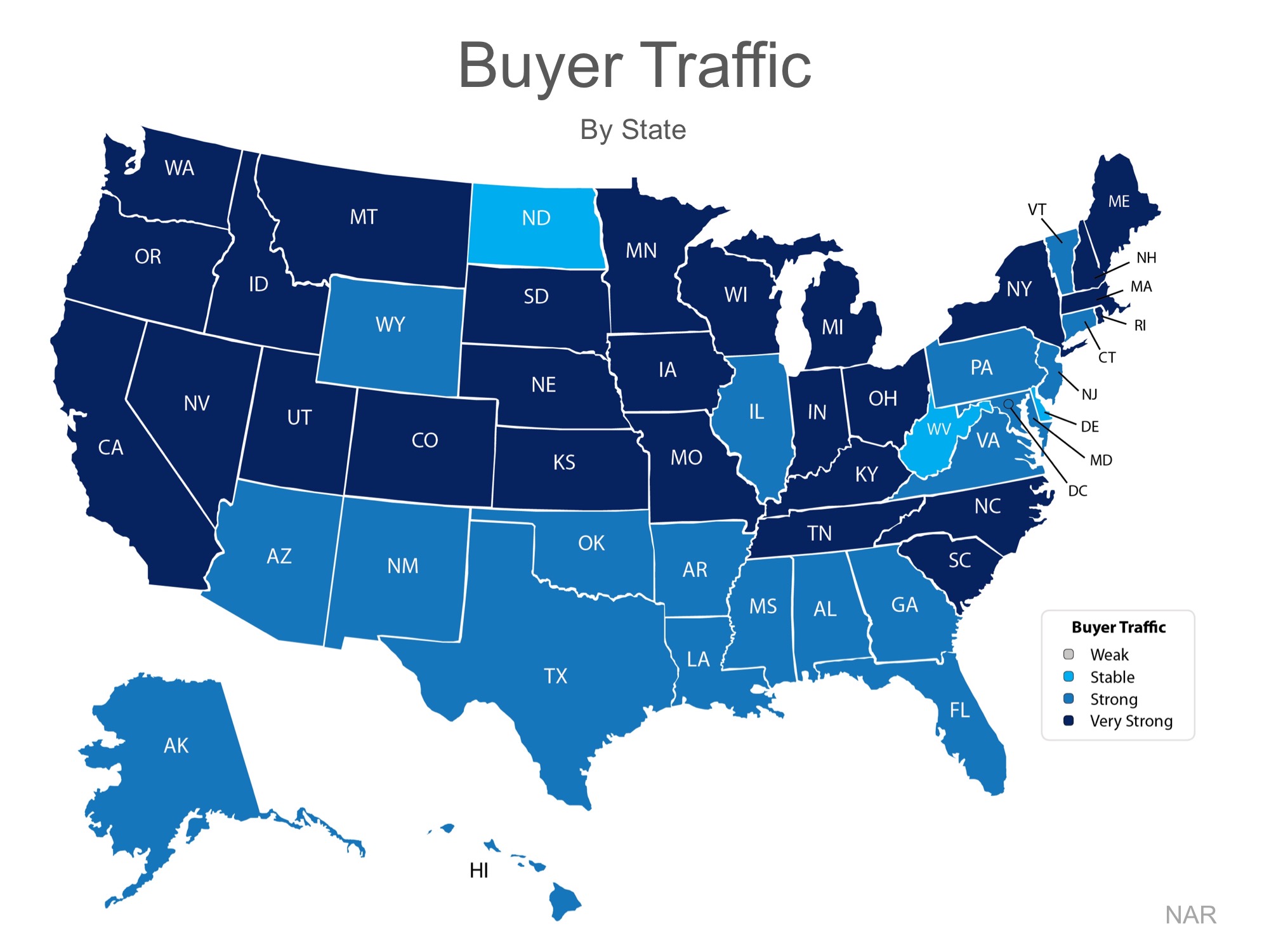
The map below was created after asking the question: “How would you rate buyer traffic in your area?”
The darker the blue, the stronger the demand for homes in that area. Only three states had a ‘stable’ demand level.
Seller Supply
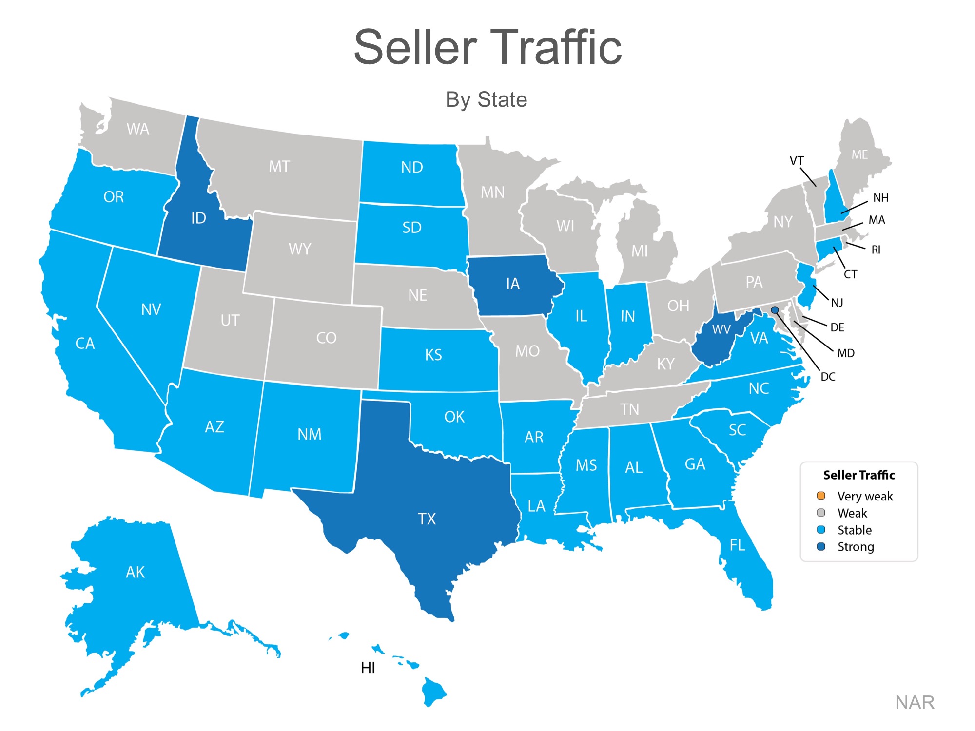
The index also asked: “How would you rate seller traffic in your area?”
As you can see from the map below, 21 states report a ‘weak’ sellers traffic, 25 states report a ‘stable’ sellers traffic, only 4 states and DC report a ‘strong’ sellers traffic. Meaning there are far fewer homes on the market than what is needed to satisfy the buyers who are out looking for their dream homes.
Bottom Line
Looking at the maps above, it is not hard to see why prices are appreciating in many areas of the country. Until the supply of homes for sale starts to meet the buyer demand, prices will continue to increase. If you are debating listing your home for sale, let’s get together to help you capitalize on the demand in the market now!
[/vc_column_text][/vc_column][/vc_row][vc_row][vc_column][vc_empty_space height=”16px”][/vc_column][/vc_row][vc_row css=”.vc_custom_1491963877807{background-color: #e0e0e0 !important;}”][vc_column width=”1/12″][/vc_column][vc_column width=”1/3″][vc_cta h2=”” txt_align=”center” css=”.vc_custom_1491964058376{margin: 0px !important;border-width: 0px !important;padding: 0px !important;background-color: #e0e0e0 !important;}”]If you like what you see and think this post could help someone, please share[/vc_cta][/vc_column][vc_column width=”1/12″][/vc_column][vc_column width=”1/2″][vc_column_text][apss_share][/vc_column_text][/vc_column][/vc_row]

